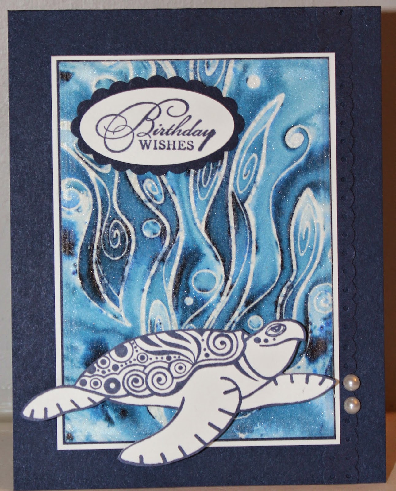
Bister came in containers you could open and dump all the grains out. With Brusho you could do that but they say to punch a hole in the top of the container and shake the Brusho out. However you get the Brusho out of the container just like Bister you add water to get a watercolour you can then paint with. Just like Bister you get these cool effects by misting it. Different grains turn different colours and spread out all over to get a really neat colour effect. Bister always had brown grains mixed in while Brusho doesn't so the colours are brighter.
As for price, I got my Bister from "I Brake for Stamps" where they were selling all 8 colours for $13.20 or $1.65 each. Add in shipping to Canada and I got all 8 colours for about $22 US. I couldn't find Brusho anywhere close to me. Amazon.com has some but they won't ship to Canada. I checked their prices and they are selling a 12 pack starter set for $65US! (I also noticed they have 8 NEW colours that I don't even have!!! MUST GET!) I ended up getting mine from the UK through eBay and it cost me about $70 US for all 24 colours.
The most obvious difference is the colours. Bister comes in 8 colours and all are very natural looking colours. All have that brown tone to them. Brusho comes in 24 different colours and are very bright and vibrant.
Here are the different colours of Brusho:
Black:
This is photographed against a background of Stampin Up! Basic Black cardstock. On the right side is a square of watercolour paper that I sprinkled a little bit of Black Brusho onto and then misted with water. You can see up close that there are little grains of blue, orange and purple colours that then spread out. When you mix them together you get the piece on the left (which is also on watercolour paper).

Grey:
This is again photographed against a background of Stampin Up! Basic Black cardstock. Here you can see what the grey looks like when mixed so I didn't bother making another square. Very similar to Black.

Purple:
This is photographed against a background of Stampin Up! Basic Elegant Eggplant (on the bottom) and My Favorite Things Grape Jelly (on the top) cardstock. I'm going to do a comparison later on and when I sprinkled the Purple on then it looks quite a bit more like Stampin Up! Rich Razzleberry. But here it didn't. I guess it depends on how much of each different coloured grain comes out.

Violet:
This is photographed against a background of Stampin Up! Basic Elegant Eggplant cardstock. On the right is the colour you get when you mix the grains together.

Here are the purples together against a background of Stampin Up! Basic Elegant Eggplant cardstock:

Gamboge:
This is photographed against a background of Stampin Up! Daffodil Delight cardstock.

Lemon:
This is photographed against a background of Stampin Up! Daffodil Delight cardstock.

Yellow:
This is photographed against a background of Stampin Up! Daffodil Delight cardstock.

Here are all the different yellows photographed against a background of Stampin Up! Daffodil Delight cardstock. Gamboge is on top, Lemon in the middle and Yellow at the bottom:

Orange:
This is photographed against a background of Stampin Up! Pumpkin Pie cardstock.

Dark Brown:
This is photographed against a background of Stampin Up! Soft Suede cardstock.

Light Brown:
This is photographed against a background of Stampin Up! Soft Suede cardstock.

Here are the two Browns together on Soft Suede. The Dark Brown is on the left. Hard to tell them apart.

Vermillion:
This is photographed against a background of Stampin Up! Real Red cardstock.

Crimson:
This is photographed against a background of Stampin Up! Real Red (top) and Cherry Cobbler cardstock. Here you could clearly see the different coloured grains so I mixed them together to see what they would look like combined.

Brilliant Red:
This is photographed against a background of Stampin Up! Real Red cardstock.

Ost. Red:
This is photographed against a background of Stampin Up! Real Red cardstock.

Scarlett:
This is photographed against a background of Stampin Up! Real Red cardstock.

Here are all the reds photographed against a background of Stampin Up! Real Red cardstock.
From top to bottom: Vermillion, Crimson, Brilliant Red, Ost. Red, and Scarlett.

Cobalt Blue:
This is photographed against a background of Stampin Up! Pacific Point cardstock.

Ost. Blue:
This is photographed against a background of Stampin Up! Pacific Point cardstock.

Prussian:
This is photographed against a background of Stampin Up! Night of Navy cardstock.

Turquoise:
This is photographed against a background of Stampin Up! Pacific Point cardstock.

Ultra Marine:
This is photographed against a background of Stampin Up! Pacific Point cardstock.

Here are all the Blues together. From left to right: Cobalt Blue, Ost. Blue, Prussian, Turquoise, and Ultra Marine.

Emerald Green:
This is photographed against a background of Stampin Up! Kiwi Kiss cardstock.

Sea Green:
This is photographed against a background of Stampin Up! Kiwi Kiss cardstock.

Leaf Green:
This is photographed against a background of Stampin Up! Kiwi Kiss cardstock.

Here are all the Greens together. This is against a background of Stampin Up! Lucky Limeade cardstock. From left to right are: Emerald Green, Sea Green and Leaf Green.

Side by Side Comparison
Here's a better comparison. For these pictures I sprinkled some of the Brusho onto watercolour cardstock and then used a wet paintbrush to mix the colours together.
Here are the blacks together. The middle is just the Black Brusho watered down. You can tell the difference between the watered down Black and the Grey -- the Grey is a bit warmer.

Here they are photographed against a background of Stampin Up! Basic Black cardstock:

Here are the browns together. The middle is just the Dark Brown Brusho watered down. I couldn't tell the difference between them really. The Light Brown was much lighter but then I added more Brusho and it came out darker. So to me it was really just how concentrated the colour was.

Here they are photographed against a background of Stampin Up! Soft Suede cardstock:

Here they are photographed against a background of Stampin Up! Crumb Cake cardstock:

Here are the yellows (and orange) together. Not a big difference between the yellows. The Lemon is the most like Daffodil Delight. The Yellow is quite similar but with a bit of a brown tinge to it. The Gamboge has a bit more orange to it.

Here they are photographed against a background of Stampin Up! Daffodil Delight cardstock:

Here are the purples. You can definitely tell a difference here. The purple is also quite a bit different than the first time I did this.

Here they are photographed against a background of Stampin Up! Rich Razzleberry cardstock. The Purple is quite close in colour:

Here they are photographed against a background of Stampin Up! Elegant Eggplant cardstock. The Violet is close in colour but a bit brighter. I also included the other Purple swatch here so you could see the difference. That's the one on the very left:

Here are all the reds. These are very difficult to tell apart. The Crimson has a touch more brown and the Vermillion and Ost. Red are a bit lighter but very hard to tell Brilliant Red from Scarlett and Ost. Red from Vermillion (Vermillion has a touch more brown to it). But all very similar.

Here they are photographed against a background of Stampin Up! Real Red cardstock. Scarlett came closest but it doesn't quite match:

Here are the greens. None of these match any cardstock I have but the Sea Green does come closest to Stampin Up! Garden Green. It's a bright colour of grass. But you can tell there is a difference between each green.

Here they are photographed against a background of Stampin Up! Garden Green cardstock.

Here they are photographed against a background of lime green cardstock.

Here are the blues. These are all quite distinctive. The Cobalt Blue is very close to my favourite colour Stampin Up! Pacific Point. The Prussian is quite close to Stampin Up! Night of Navy.

Here they are photographed against a background of Stampin Up! Pacific Point cardstock.

Here they are photographed against a background of Stampin Up! Night of Navy cardstock.